In 2022, we evolved our visual identity to reflect the progress in our business. These updated guidelines are designed to provide clarity in the use of this evolving visual identity. The latest evolution of our visual identity is designed to better reflect our current market strength and our business strategy going forward.
As our business develops, it is necessary to ensure that our visual identity represents our ambitions and is consistently applied.
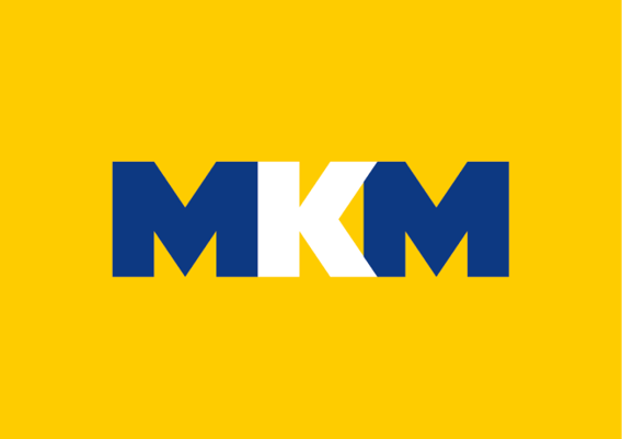
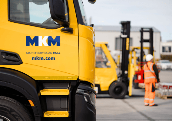
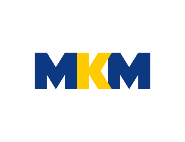
The primary logo should be used on a yellow background wherever possible, using the blue/white work-mark.
Logo variations
Secondary logo
The secondary colourway would be used when the logo needs to be added to a white background, for example on letterheads or cleaner, premium artwork.
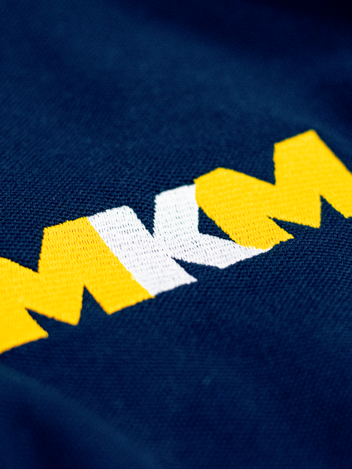
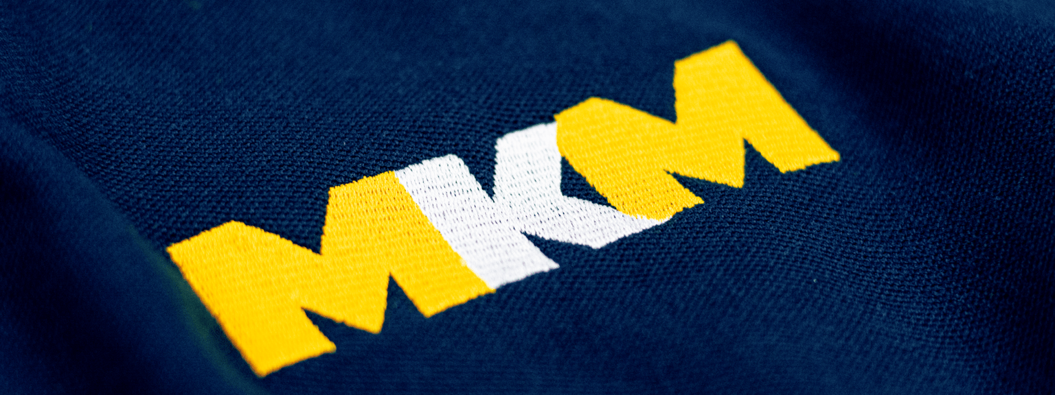
Tertiary logo
The tertiary colourway should only be used when no other colourway is viable. An example of this would be on our blue workwear.
Single colour logo
The single colour logo is for use when the method of reproduction makes it impossible to replicate the others to a high quality.

Our colour palette has been designed to help us stand out within our market. The colours have been selected to create fresh, modern and confident communications. How we use these colours is key.
Our core colours
Our core brand colours consist of MKM Yellow and MKM Blue, which are used in two distinct ways. The MKM Blue acts as an accent colour and the MKM Yellow works as a base colour, a foil to the darker blue.

MKM Yellow
HEX #FFCC00, CMYK 0 20 100 0, RGB 255 204 0, Pantone 116C, and RAL 1023.

MKM Blue
HEX #143981, CMYK 100 80 0 18, RGB 20 57 129, Pantone 286C and RAL 5002
Proxima Nova and Din Stencil typefaces are used for all professionally printed communications, and for graphics within MKM digital communications. They have been selected for their clean, modern design and wide variety of weights.
External typeface
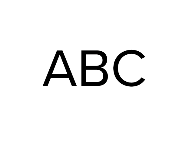
Proxima Nova
We use a variety of weights from Proxima Nova family. This gives us flexibility to create typographic hierarchy and emphasis key points
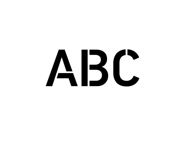
PF Din Stencil
We only use the medium uppercase version of the Din Stencil family, and only use within trade communications. This should be used for highlighting key words within the main headings and to emphasis important information.

This brand guideline serves as a comprehensive guide to our brand's visual identity, voice and messaging, and overall brand strategy. It includes information on our brand's mission and values, guidelines for logo usage, typography, color palette, and imagery, as well as guidance on how to communicate with the audience in a way that aligns with our brand's tone of voice and messaging.